
The work of assuring content is accessible is often viewed from the viewpoint of already created content. Content that has already been created once may give the impression of extra work; the act of assuring the content is accessible additional work.
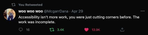
Dana McGarr had the best tweet earlier this week…
COVID-school has forced many educators online and the past year has seen much content recently created. While recent content may have to be vetted for accessibility, now is the time to create accessible content so it is no longer additional work.
Accessibility
As documents are crafted, there are guidelines that can be helpful. WebAIM (n.d.) offers several types of recommendations. Each category offers usability options for the end-user which would otherwise preclude them from interacting successfully with the document content. Check out the below links to take those old Microsoft Word documents you have and give them a needed upgrade:
Microsoft Accessibility Checker
Make Word Documents Accessible to People with Disabilities
As documents are crafted, there are guidelines that can be helpful. WebAIM (n.d.) offers several types of recommendations. Each category offers usability options for the end-user which would otherwise preclude them from interacting successfully with the document content.
Text Formatting
Headings are meant to be applied in descending order. Heading levels are not to be skipped as any text reader depends on the heading hierarchy. These same principles work for Search Engine Optimization (SEO) in your online content as well; Headings are a good practice all around!
Image Formatting
Alternative text and image captions should be applied to all images within a document. Alternative, or alt, text is what a screen reader will read. Text in front of or behind images will not be read as the alt text or caption of the image. Microsoft Support (n.d.) offers an accessibility checker to identify images that are not appropriately labeled.
Other Formatting
Use keyboard buttons like the tab button, use formatting options in the editor ribbon, like indent or numbered list for the ease of a reader using a screen reader.
Use text colors sparingly – and keep it to black as possible. But if you need to mix up the color remember to adhere to a minimum contrast ratio is 4.5 to 1.
A tool for content designers is the WebAIM Contrast Checker. The Contrast Checker will provide that feedback in a quantitative way for content creators. The school or district color pallette may need to be reconsidered or repurposed if the colors cause accessibility issues.
Conclusion
The act of making content accessible is an act of caring and both morally and legally correct. Much of the consternation may be due to teachers like to recycle content; recycled content is more likely to need an accessibility upgrade. If teachers can view the act of making content accessible as another way to care for students, the act of making accessible content may be easier for educators.
References
Microsoft Word Creating Accessible Documents. WebAIM. (n.d.). https://webaim.org/techniques/word/#headings.
Contrast Checker. WebAIM. (n.d.). https://webaim.org/resources/contrastchecker/.
Windows: Best practices for making Word documents accessible. Microsoft Support. (n.d.). https://support.microsoft.com/en-us/topic/make-your-word-documents-accessible-to-people-with-disabilities-d9bf3683-87ac-47ea-b91a-78dcacb3c66d.


1 Pingback